I recently watched the first series of The Walking Dead tv program which had been based on the comic book originally written by Robert Kirkman. It was interesting to see the conversion between the graphic narrative and the tv series, especially with how they kept some of the story line and characters from the plot in the comic book series. I found the trailer really catchy with the story line being different to a Zombie/Horror film I'd ever seen in the past. The modern set story line makes it feel really realistic. I really enjoyed the series and it proved itself to how catchy the trailer was. I like the story lines in it and it has allowed me to see more branches in different directions within the Horror genre. I would consider using something like this for my project but not too similar, for one problem being the large budget used in The Walking Dead Series.
Recently I have studied graphic narratives other than just comic books. Artist Dave McKean has designed and illustrated for magazines and art exhibitions. I took 2 extracts where he has illustrated for adverts, showing the importance of social work. The illustration showed how someone who survived the Holocaust has been aided by social workers allowing them to cope a little easier with their mental damage. Even though Dave used colours that made the pictures look very dated such as yellows and a sepia style theme, his drawings and mix of illustration plus photos gives it a modern art style effect but at the same time shows the development from events in the 1940's to present day. He captions the panels as if we are the social worker, making it persuasive to help. The modern and unique style of Dave Mckean is emphasised by the different panel sizes, they all vary with some overlapping and others at different angles, unlike a classic straight layout.
These illustrations has added to my knowledge of designing graphic narratives showing the different styles rather than the classic comic book. I really like the variation of using illustration and photos. I also like how the panels aren't just in straight lines but overlap and create more of a collage theme. I will definitely take the style of this illustration into account when designing my graphic narrative.
While researching Dave McKean in more detailed I found his work from 1989 where he illustrated the Batman comic "Arkham Asylum: A Serious House On A Serious Earth". Studying this showed his own style when illustrating superheroes, a lot different to many of the other Marvel and DC comics.
Refreshing the idea of Narrative Theories allowed me to be able to think about what type of characters I can put in my graphic narrative. One main example of a theory is Vladimir Propp's narrative model, a famous idea among classic Hollywood films. From this I applied each example to a character in either a film, a graphic narrative or a video game -
The Villain - The Joker (Batman)
The Dispatcher - Gandalf (LOTR)
The Helper - Sam Wise Gamgee (LOTR)
Princess/Item - Peach (Mario). This idea was not always a female being rescued like in Disney films, but possibly a male or an item or even something like freedom.
Donor - Alfred or Lucious Fox (Batman)
Hero - Harry Potter
False Hero - Lando Calrissian (Star Wars)
During analysing a narrative other things to study included -
The Setting
The Characters
Binary Opposites
Emotion Content
Enigma Content
Enigma Codes
Equilibrium
Themes
I then applied this to an extract from The Hulk comic book -
The extract was set in the desert implied by the cacti and the other surrounding images suggesting so.
The main characters were Hulk/Bruce Banner (Hero), Betty Ross (Princess), Boomerang (Villain), General Ross (Villain/False Hero/???).
The obvious binary opposite was Hulk and Boomerang contrasting by being the Hero and the Villain in the narrative. Another possible example could be Betty Ross and General Ross by their contrasting views on Hulk/Bruce Banner or their Father/Daughter relationship.
The narrative follows an idea of equilibrium. For example Hulk is alone (Equilibrium), then Boomerang captures Betty Ross (Disturbance), followed by Hulk continuously chasing Boomerang until he retrieves Betty Ross (New Balanced Equilibrium).
Before beginning the year we watched a number of films, mainly in the horror genre to show the ease of creating a trailer in this genre. One of the films watched was Let The Right One In (2008) directed by Tomas Alfredson. The original of the American big hit, showed suspense filled scenes and well used Mise which would be accessible to students. Unlike the American remake, where more computer generated effects are used. The film tells the story of a bullied school boy who then falls in love with a mysterious new girl in his neighbourhood later to find out she is a vampire. The film uses dark colours and suspense brilliantly, proving you do not need a large budget and a heavy use of computer generated effects to create horror.
Genre - Self explanatory, what ever category the media example fell into.
Layout - In Graphic Narrative terms this could be to do with the layout of the panels, colours, choice of art style (hand drawn), font.
Technical and Audio Codes - The use of voice overs, colours, music, sound effects, shot choice, shot angle and editing.
Mise-en-scene - Everything than comes inside the frame of view, including props, costumes, set background etc.
Learning/Reminding myself on what all these terms meant, I was able to apply them to 2 extracts and to pick up on details of the conventions of the genre.
#1 - The Walking Dead Season 3 Trailer -
The music contrasts the theme of the trailer. The first song being very much a soft, gentle happy song while watching the killing and panic of the actors. This perhaps suggests the hope these people have left in saving their world, reinforced by the emphasis on "taking back what is ours" throughout the second half of the trailer. The second song sounds like a very traditional American style guitar and perhaps suggest their spirit and pride is still alive even with the majority of the world dead.
Many of the camera shots are close up shots and many extreme close ups. This creates a more personal feel for the viewer as if they are involved in the show. It allows the viewer to feel the emotions the characters do also.
The camera is sometimes handheld which emphasises the fear and panic of the characters in certain scenes.
The trailer opens with a shot of the American flag (Mise-en-scene), but it's torn. Perhaps this reinforces the idea of keeping their pride and determination alive or the tear is a symbol of the fall of America.
Many of the colours are dark and dreary.
Between shots the cuts are fast.
The trailer contains a lot of violent and graphic images perhaps not what you'd expect in just a preview trailer. This perhaps suggests that if scenes in the trailer are this detailed, the actual show is going to contain even more similar scenes and with added detail to gore and action.
A few times in the trailer the camera angle is below the humans suggesting that they are still superior to the zombie outbreak.
By the use of Zombies it would be typical to say that The Walking Dead comes into the Horror genre or even it's own Zombie genre. But with the added action, suspense and drama it makes it hard to just class it into one category. Thriller? Drama? Action?
Later on in the trailer the colours skip between dark and light more often, suggesting again that there is still a slim chance of hope.
#2 - American Splendor: Our Movie Year (Pekar 2004) - Comic Book Extract
The Genre is Drama/Comedy, even if it's not to everyone's taste. The comic turns one man's life's events into an amusing comic book.
Angles/Shots - There's an eye line match between the shop worker and Harvey in the 4th panel. The angle shows the shop keeper looking down on Harvey emphasising his size.
There are extreme close ups on Harvey's eyes then to the name badge to show what he's looking at.
The middle two panels are close ups just to simply show who's talking and the main attention.
Style and Layout - The speech bubbles are quite typical for comic books, with the font all in capitals.
The panels are laid out in a simple and straight arrangement.
The colour scheme is black and white.
These simple actions put the focus more on the storyline and dialogue.
Mise-en-scene - In the opening panel the signs and checkout show that it's set in a supermarket.
The use of depth of field has the shop worker the main attention in the foreground, Harvey in the middle and the worker at the till in the background.
Effects - Darker shades are used on the employee especially in the final frame.
There is a general lack of effects.
Learning new terms and refreshing my knowledge of ones I already knew, has allowed me to extract the essential conventions of the Zombie/Thriller trailer and the simple comic book strip. I feel that if I can find details from these extracts in depth like so, I can put them into my own ideas when creating my graphic narrative and my film trailer.
There are many styles and genres of graphic narratives and they vary in what format they are in also. For example, some include; comic books, graphic novels, cartoon strips, photo stories, packaging, advertising, publicity material and digital media. All formats represent a form or either fiction or non fiction that tells a story in a sequential, graphic narrative.
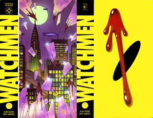
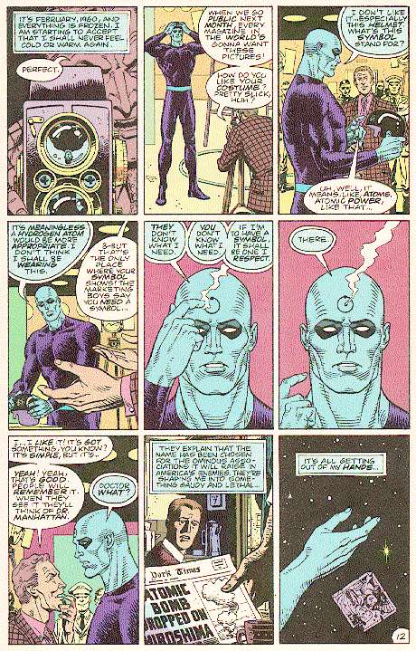
A number of examples were available to study and make notes on. I chose a graphic narrative called Watchmen. The comic book series was created by writer Alan Moore, artist Dave Gibbons, and colouristJohn Higgins. Some would say that Watchmen is a Superhero based narrative but the story takes digs and critisices the Superhero concept. Watchmen depicts an alternate history where superheroes emerged in the 1940s and 1960s, helping the United States to win the Vietnam War. The country is edging towards a nuclear war with the Soviet Union, freelance costumed vigilantes have been outlawed and most former superheroes are in retirement or working for the government. The story focuses on the personal development and struggles of the protagonists as an investigation into the murder of a government sponsored superhero pulls them out of retirement, and eventually leads them to confront a plot that would stave off nuclear war by killing millions of people. Watchmen is a hand drawn comic book. Throughout the comic book the colour scheme tends to follow a dark theme, even when using primary colours. The comic book has also been made into a film and also there is a story within the story called Tales Of The Black Freighter.
Official Watchmen Trailer
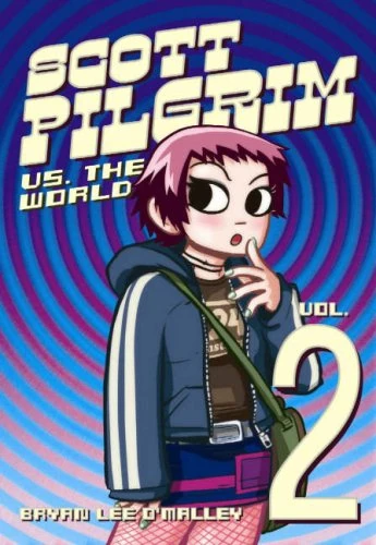
I also looked at the series of Scott Pilgrim Vs The World Comic Books. The style was completely different in comparisson to Watchmen. It has been drawnin black and white, relying more on the amount of shading. Like Watchmen, Scott Pilgrim has been made into a film. It was then made into a retro styled video game.
After reading through a book showing "101 ways to tell the same story" but through different styles of graphic narrative, I attempted to tell the same story twice through different styles. It allowed me an introduction to the many types of styles that are used in graphic novels and gave me a brief idea on what style I'd like to design my own around.
The example we were first shown tells the story of a man getting up from his work, walking out the door, being asked what the time is and replying, then continuing to the fridge before thinking to himself "What the hell was I looking for, anyway?!"
We were then shown this exact same story but in a number of different styles. These included:
Real life photos.
Close ups.
Romantic.
Alien themed.
Super-hero themed.
Silhouettes.
Coloured.
The next task was to tell our own graphic narrative using the given story:
The lesson was finally finished, 5 minutes late!
You leave the classroom and run down the corridor to meet your friends for a meal.
You're at the back of the line.
And as you get to the front you realise your friends have already got their meal and not saved a space.
You have to sit alone.
I had to tell my narrative in a "Romantic" style:
In this style I have tried to use colours associated to love and romance, red being the prime example. I kept the story line but the Romance style forces you to tweak it in places making it more based around love and relationships.
And also part of a "Close Up" style:
The exercise showed me the many ways that graphic narratives can be shown in rather than just assuming that they are all like superhero comics. I probably wouldn't use the Romantic theme as the style doesn't appeal to me a lot and the drawings are a bit more challenging. The Close Up style was a lot easier, but it's not a particularly exciting style.
The unit requires you to engage with contemporary media technologies, giving you the opportunity to develop your own skills in these technologies. It also enables you to develop the skills of presentation that are required for further study at higher levels and in the workplace.
From this brief you will produce:
A media portfolio, comprising a main text.
A presentation of research, planning and evaluation in digital formats.
The media portfolio will be produced through a combination of 2 or more of the following media:
Video
Print
Each candidate will reflect upon their work digitally. This evaluation may be done collectively for a group production or individually. Examples:
A blog
DVD
Powepoint
MARKED OUT OF 100.
Evaluation:
In the evaluation the following 4 questions will be adressed:
In what ways does your media product use, develop or challenge forms and conventions of real media products?
How effective is the combination of your main product and ancillary texts?
What have you learned from audience feedback?
How did you use media technologies in the construction and research, planning and evalutation stages?
Assignment Brief:
You have been commisioned by a production company to create a promotion package for a new film, inspired by an original greaphic narrative idea of your own.
To include a trailer, plus:
A film magazine front cover, feat. the film.
A poster for the film.
This will be done in 3 stages:
Research - including film trailer and graphic narrative case studies. Magazine and poster conventions.
Construction - Of your trailer, magazine cover and poster.
Evaluation - Work on throughout stage one and two.